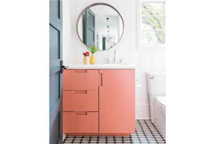
Small and self-contained, powder rooms are packed with potential. They’re faster and more economical to paint than larger spaces (you can tackle them over a weekend with fewer gallons), and when tastes or trends change — or when the big experiment backfires — it’s easy to put them right again.
According to Cortney Bishop, principal designer and owner of Cortney Bishop Design in Charleston, S.C., “powder rooms are always a great place to throw in color — something that brings all the colors of the house together.” Or they can be a place to step outside of your comfort zone with something completely different.
“Powder rooms give you the freedom to express yourself. It doesn’t have to correlate with the rest of the house,” says Mikel Welch, who has designed for Michelle Obama and Oprah Winfrey. “Go into the lab and mix things around until you figure it out. Have fun, and show your personality.”
The bottom line: Your powder room is your playground. There are no rules. We asked several experts to share their favorite powder room paint colors. Here are their picks:
What it looks like: This earthy tone blends red and yellow to create a warm, terra-cotta feel. It responds well to the changing sunlight throughout the day.
What designers say: “It does feel earthy, but it’s unexpected,” Bishop says. “It’s definitely a risk. We find it works really beautifully with creamy white, brown and green tones and all [accent] shades, like yellow and green.”
Red Earth pairs well with honey-blond wood, Bishop says, such as on a custom vanity or a wood-framed mirror.
Urbane Bronze | Sherwin-Williams
What it looks like: There’s nothing bronze about Sherwin-Williams’s 2021 Color of the Year; it’s actually a deep neutral that finishes brown-gray.
What designers say: “It’s moodier,” but it works, Bishop says, especially when paired with a brighter color. “Make sure you bring in a great mirror, so it’s not too dark,” she adds.
Consider accenting your bold paint with wood or wallpaper on the top third of the wall, she says. “It’s that little touch of thoughtful wallpaper — not covering the whole room, but that accent — that helps those colors play out without feeling cavernous or dark.” Bishop also suggests brass accents, such as on the legs of a vanity. “Those shiny, reflective materials really elevate the design, so it feels a little more sophisticated,” she says.

What it looks like: Michigan designer Haneen Matt blended these deep blue-greens (three parts Abysse, one part Ocean Abyss) to achieve her desired teal for her own powder room.
What designers say: “I was trying to get the perfect blue-green that looked rich and sophisticated (which is tricky! I didn’t want it to look like a juvenile turquoise/teal),” Matt said in an email.
Like Bishop suggests, Matt painted the lower two-thirds of the walls, then complemented the dark paint with light wallpaper. She chose Palazzo by Thibaut. “It’s an old-world architectural cityscape,” she wrote. “You can get lost in it. ”
Matt also brought in metallic fixtures and an unexpected floral shade that contrasts with the whimsical wallpaper.
School House White | Farrow & Ball
What it looks like: Reminiscent of the soft off-white frequently found in old schools, this neutral color feels warm and timeless.
What designers say: This versatile white works with many styles and colors, Bishop says. “The reason I would suggest white on the wall is that you can then paint the vanity or the cabinet a really great, punchy color,” she says, such as Red Earth.
Card Room Green | Farrow & Ball
What it looks like: This subtle sage green gives off a Victorian-study vibe and goes well with any warm neutral, such as off-white.
What it looks like: Although Bishop says this go-to color comes across as beige in online images, in real life it finishes as more of a muted sage green with hints of silver.
What designers say: It’s a solid complement to any light neutral. Bishop pairs Ball Green on the ceiling with walls in School House White, for example, because both colors are warm and they work well together. “It’s a combination that I’ve been extremely happy with for several clients, as well as for myself,” she says.ADhttps://ee0615b54796e4eccb3041da4f04a006.safeframe.googlesyndication.com/safeframe/1-0-37/html/container.html
Gentleman’s Gray | Benjamin Moore
What it looks like: This moody gray-blue that leans toward classic navy is a great choice for a dark and bold neutral that’s not black.
What designers say: “It’s really interesting, but it’s also not a hot pink. You could tie it into the rest of your home easily,” says Catherine Williamson of Columbus, Ohio-based Beginning in the Middle.
Studio Clay | Sherwin-Williams
What it looks like: This neutral brown tone produces a sophisticated finish, especially when offset by light baseboards and a light ceiling.
What designers say: “It’s earthy, moody and neutral,” Williamson says. She hates to paint, so she opts for neutrals over trendier colors every time.ADhttps://ee0615b54796e4eccb3041da4f04a006.safeframe.googlesyndication.com/safeframe/1-0-37/html/container.html
Williamson also suggests introducing bold colors and patterns with rugs and art. “The power of one piece of art in a room, especially like a powder room, it would produce a completely different look,” she says, or mix several styles in a gallery wall. “You can get bold without committing long-term.”
What it looks like: This ink black with green undertones creates a chalky effect. Juxtaposed with light neutrals, the finish is classic and crisp.
What designers say: Like Urbane Bronze, Welch says Greenblack works because “it has a chalkiness to it, so it’s not a stark black.”
For optimal effect, Welch suggests color-blocking: only painting a portion of the wall with the dark tone.
“One horizontal stripe splits the entire wall in half with a lighter tone on top, darker tone on bottom” — or the inverse, he says. “It gives the effect of a faux chair rail.”


